The days of simply listing your dispensary products on marketplaces like Weedmaps are long gone. Retailers are creating stunning owned digital experiences, while focusing on sustainable digital marketing strategies like SEO and website conversion.
Sites like Leafly and High Times used to be the only online arbiters of cannabis information, but now it’s local dispensaries offering some of the best content.
Ingredients of a great dispensary website
While reviewing dozens of cannabis business sites for this article, several themes emerged among the most beautiful and engaging websites:
1. Credibility and trustworthiness
Cartoon graphics of bongs and pot leaves don’t lend credibility to your dispensary. Consumers want medical cannabis, CBD, THC, and recreational cannabis products that boost their health, productivity, and creativity. Many don’t resonate with stereotypical “stoner” vibes.
2. Online ordering menu
An important part of every dispensary website is a menu that allows customers to order ahead from the comfort of their own homes for pick-up or delivery.
Online menus allow customers to see what products you sell and also initiate the transaction. A growing trend among successful cannabis retailers is a shift in focus away from marketplaces to hosting native menus within a dispensary’s site.
Read next!
Tips for Setting Up Dispensary Online Ordering
3. Owned website domain
The best sites don’t rely on a third-party vendor or marketplace to host their website. They establish brand credibility with their own site domain and original content.
4. Fresh color scheme
Not surprisingly, the vast majority of cannabis websites are overwhelmingly green. While this may seem like a logical design choice, to capture consumer attention, focus on white space with bright pops of unexpected colors. You can still use green as a primary brand color, but use it as an accent.
5. Valuable content
The best sites increase engagement with their audience (and with Google) by keeping their original content fresh and informative, whether in the form of blogs, videos, or social media posts. Even if you aren’t blogging, always keep your site current.
6. Focus on wellness
The cannabis industry is now a major part of the wellness business. Successful dispensaries find new cannabis consumers by educating their local communities about how cannabis relates to wellness and engaging them through their websites, emails, and social channels.
7. Beautiful photographs
If a limited budget means you have to choose between a designer and a professional photographer, go with the photographer. Highlighting gorgeous products and spaces and featuring staff with quality portraits helps boost the beauty and credibility of your site.
8. Creative product categorization
An emerging trend for dispensaries is to categorize their cannabis products into solutions to specific problems. It’s less about indica and sativa, and more focused on science-based concepts like terpene profile, effects, and lab testing results. Some brands also include product reviews so customers can learn more before they buy.
11 examples of great cannabis websites
Here are cannabis dispensary website examples that have eye-catching web design, organized content, and trustworthy answers to common questions, listed in no particular order:
High Seas
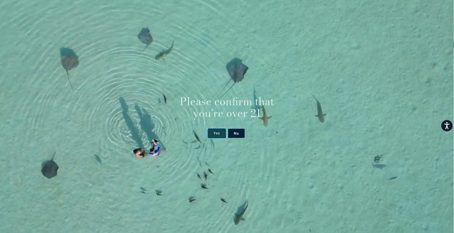
One of the most mesmerizing and outstanding websites in cannabis belongs to High Seas—a premier cannabis boutique in Costa Mesa that doubles as an aquatic sensory experience.
Upon entering the warehouse-sized store, shoppers are transported on a sensory journey that engages touch, taste, sight, hearing, and smell. Guests are offered complimentary kombucha, water, and coffee while they're welcomed by their host and budtender, who guides shoppers through the aquarium/dispensary.
The wonder and awe served in-store at High Seas is reflected perfectly by their website, which features stunning imagery and videos, curated content and blogs, plus a seamlessly integrated catalog of products for online shoppers.
Electric Lettuce
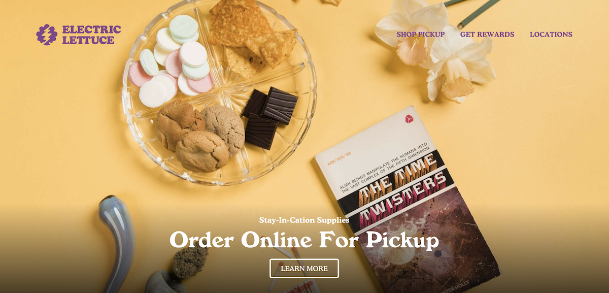
Electric Lettuce, which makes up the majority of the retail locations under the Groundworks Industries parent company, is a thoughtfully curated experiential brand.
It celebrates the sordid history of marijuana use in America between 1965 and 1971 through on-brand product selections and visually designed environments.
The Electric Lettuce website design is a stunning combination of high-quality visuals and accessible ordering across any location. It’s both user-friendly and actually enjoyable to use.
Ascend Wellness
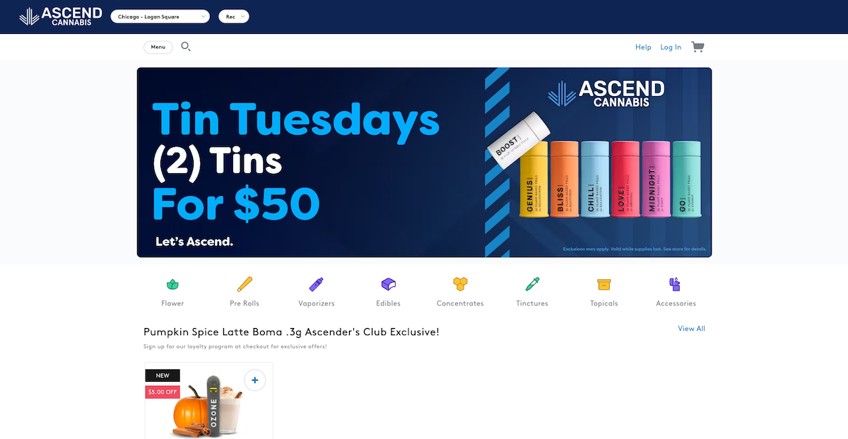
Ascend Wellness Holdings is a multi-state operator, with assets in seven states including Illinois, Michigan, Massachusetts, New Jersey, Ohio, Pennsylvania, and Maryland. Their website focuses on functionality and simplifying the user experience.
With a large number of retail locations in various states, AWH’s site makes it easy to find the nearest store, browse their menu, and get ahold of the perfect product.
Ascend also takes advantage of product-led SEO with their native Dispense menu – meaning customers searching for specific products will see their listing first.
Curio Wellness
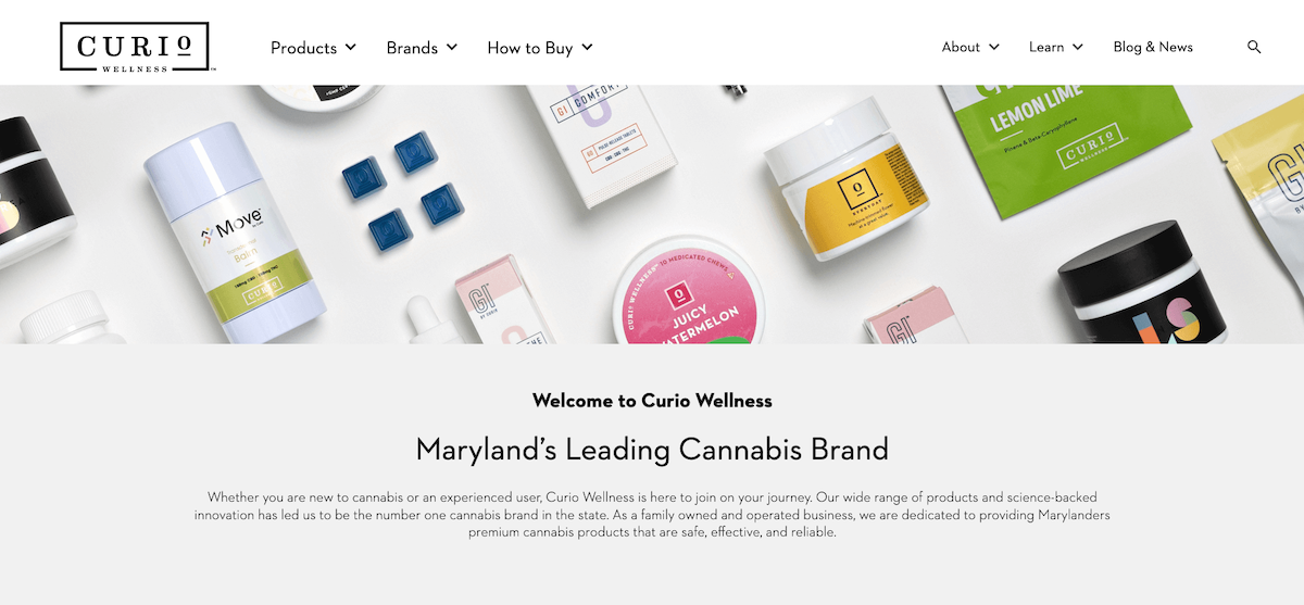
Based in Maryland, Curio Wellness is “Your Total Wellness Destination.” The clean, fresh website feels as rejuvenating as their soothing spa – a unique dispensary offering.
Curio also offers educational events as well as a holistic pharmacy that provides other health-boosting supplements in addition to cannabis.
Their focus on overall wellness, as well as their light and bright, beautifully photographed and styled site is what attracts attention and puts them in the top 11.
Thrive Cannabis Marketplace
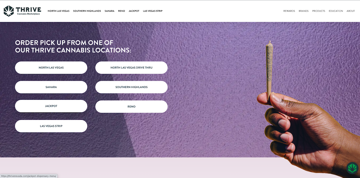
Thrive Cannabis Marketplace, an open 24/7 Nevada dispensary, distinguishes itself in many ways. Their website is well-organized, informative, and easy to navigate.
They have also established themselves as a thought leader in the cannabis space, using their website not just to advertise locations and make sales, but to educate their customers, especially those new to cannabis.
Thrive has an impressive library of articles and FAQs, as well as helpful education around topics like Las Vegas nightlife survival and cannabis tourism in Vegas.
Greatest Hits

Who doesn’t love music and cannabis together? Massachusetts retailer, Greatest Hits playfully incorporates the creativity and freedom of music into every aspect of their website with puns and nods to the related counterculture.
Greatest Hits also has an entire page filled with foundational knowledge for even the most seasoned cannabis consumer.
The approachability of this website offers a true glimpse into the Greatest Hits brand and retail experience – accomplishing precisely what a good dispensary website should.
Strawberry Fields
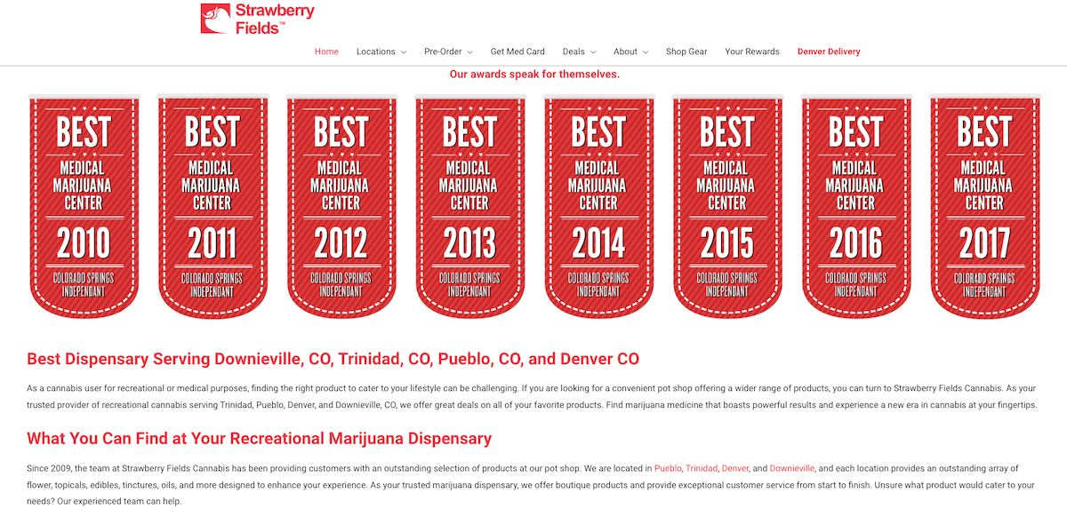
Strawberry Fields has been operating in Colorado since 2010 and now has 5 locations across the state.
Their website pops with strawberry red and does an excellent job of highlighting the many accomplishments of this seasoned dispensary business. The home page alone has reviews, awards, and even an embedded carousel of their social posts!
Something else Strawberry Fields’ site does well is offer the ability to sign up for loyalty and deals, which helps cultivate more loyal customers.
Urbn Leaf

Urbn Leaf’s mission is to help all types of cannabis consumers feel good. That goes for the products they sell, as well as the experience of using their marijuana website.
This sleek California-based dispensary’s website hits it out of the park when it comes to user experience, visual aesthetic, and highlighting important information upfront.
Their rewards page highlights a unique loyalty program that gives members points plus insider access to fresh drops, special promotions, exclusive events, and more!
The Republic
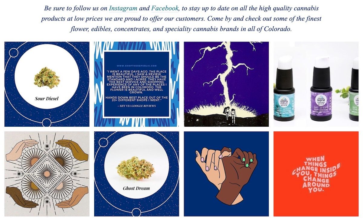
The Republic is a unique and modern vertically integrated dispensary situated on a cannabis farm in Boulder, Colorado. Their website has an eye-catching blue and white color scheme which stands out in the typically green-themed cannabis webspace.
Their site has a simple, one-page design, yet provides the essentials you need like location, store hours, and an order-ahead menu for marijuana and CBD products. It also features links to their well-maintained Instagram and Facebook pages. Staying engaged on social media is an important way to reach different customer demographics.
Good Chemistry
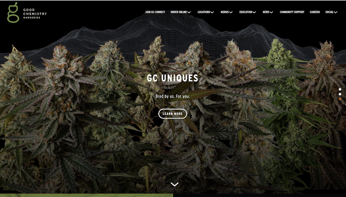
With their own line of unique small-batch cannabis strains and locations in both Colorado and Massachusetts, Good Chemistry is crushing it both in-store and online.
Their site features stunning visuals that truly highlight the beauty of the cannabis plant. They also showcase helpful cannabis education such as the STATS method (Sight, Touch, Aroma, Taste, Sensation) – which helps guide consumers to make informed purchase decisions.
Good Chemistry’s sleek, visual website and directly beneficial content is a key reason they’re on this list. If you’re looking for inspiration for your own dispensary website, this is one to look at.
Highbrow
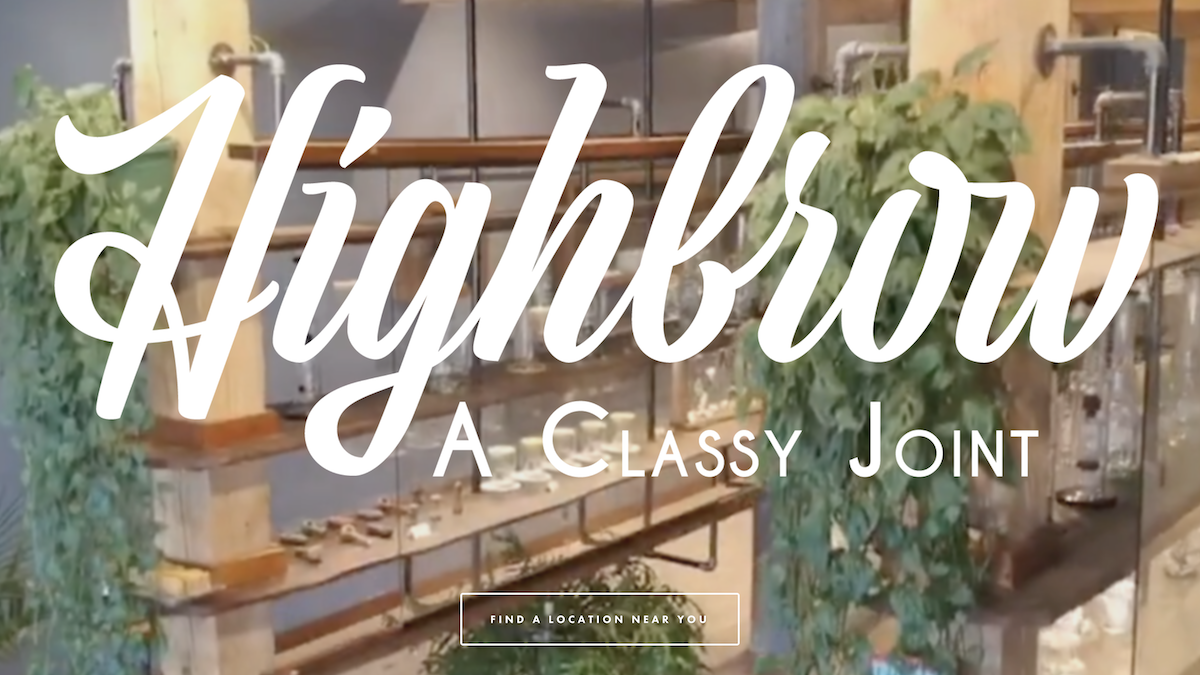
Highbrow is one of the fastest-growing Maine-owned-and-operated cannabis companies, with four current locations and one more on the way.
This dispensary brand’s website is as stunning as its physical locations – which are adorned with beautiful glass displays and hand-made cannabis accessories.
Highbrow’s featured homepage video offers video visuals into their stores, followed by up-close shots of their outstanding flower. Complete with tons of info on their in-house strains, general cannabis education, philanthropy, and more, you’ll find everything you need on this well-designed website.
Feeling inspired?
Your website should be helpful to customers, including locations, menus for online ordering, contact info, and valuable content. But it should also be beautiful, easy to navigate, and representative of your brand.
Learn how to create your website today!


