Dispensary design
Which layout is right for your store?
Take the dispensary layouts quiz to find out!
Take the quizJust like job interviews and dates, dispensary first impressions matter.
The way your cannabis dispensary looks and how you’ve designed your store flow plays a big role in customer satisfaction. Taking a look at traditional retail, we see technology playing a major role in changing the way people shop.
Traditional brick and mortar store-fronts are going away in favor of digital solutions to satisfy consumers who have strong opinions about where and how they shop. The global pandemic in 2020 accelerated ecommerce as an increasingly important aspect of the shopping experience.
While cannabis is obviously different, many of these expectations apply. People have choices about where they shop, so it’s your job to ensure you’re attracting and retaining the right customers for your dispensary.
Another thing to consider is the growing industry means a more diverse population of customers. Many marijuana customers have trepidations about walking in a cannabis dispensary for the first time. It’s important to create a positive dispensary experience for them.
Regardless of how your store looks, who your customers are, or what your objectives might be, your responsibility as a dispensary owner is to make all customers feel welcome with a thoughtful, beautiful, and authentic experience. And now more than ever, you must have well-designed workflows to help customers move through the store safely and efficiently.
Keep in mind, there’s no right or wrong here; there’s no one experience that you must provide or a vibe you must put out.
As the industry grows and customers become more diverse, we’re starting to see more diversification in how stores look, just like in retail where we have everything from thrift stores with cement floors to designer boutiques. This variety is necessary for a thriving market, and all that matters is that you figure out where you want to fit in, and then execute on that intentionally.
In the following sections, we’ll discuss the key factors that impact your dispensary design, then dive deeply into four common layouts, including how each impacts customer experience, staffing, and hardware needs. Finally, we’ll discuss other merchandising best practices to consider.



Key factors that impact dispensary layout
-
Brand
Who are you, as a brand? What’s your vibe? What do you want customers to assume and understand about you just by walking into your store? Branding is about providing an environment that they want to be a part of. Your store name, color palette, logo, interior design, and website should all represent the type of retail experience customers will have.
-
State requirements
You are responsible for understanding what your state requires by way of design, layout, and customer flow. For example, most states require a secure check-in area. Others have requirements around one budtender per customer or patient. Start with a firm grasp of what you can and cannot do before you start dreaming up design and layout.
-
Medical vs. recreational
All medical marijuana dispensaries must have a secure check-in area or waiting room. Recreational cannabis stores usually have more flexibility in layout, interior design, flow, and merchandising. Again, it’s your responsibility to have a clear understanding of what you can do based on the type of dispensary you operate. And don't forget to consider future plans, even if you can't design around them just yet.
-
Customer experience
Each different dispensary layout or floor plan will have a different impact on the customers’ shopping experience. Make sure your chosen flow matches how you want customers to feel in your dispensary. If you want a slower, educational focus, design around that. But don’t forget that your customers will have differing desires, so see how you can accommodate (such as an express lane for the in-and-out customers).
-
Inventory
How you manage inventory may not feel like a layout consideration, but different layouts will have different impacts on how you manage your inventory. For example, are all budtenders selling from the same supply, or do you have inventory per terminal? Alternatively, is all inventory in one secure place or do you have live product on the display floor? How you choose to handle this will have an impact on your inventory management and auditing process.
-
Staff
How many budtenders/cashiers/inventory personnel do you have? Depending on layout, you’ll need to consider who sells, who takes money, who fulfills orders, and how much staff overhead that requires. Also take into account busy times of day, state requirements for staff vs. patients/customers, and your overall traffic to determine the correct staff numbers. Be aware that some store designs will require more staff to manage correctly.
-
Space/store location
The physical space you have may determine how your store looks. If you have a strip mall-type location with windows, and high foot traffic, you may want to build an extended waiting area around a corner to offer privacy. If you don’t have any windows or natural light, consider how that will impact interior design, colors, art, and lighting choices. Ultimately you will have constraints — either in your actual space or your budget — that may mean you can’t execute on all your ideas.
-
Customers
The final component is considering what your customers want. How do they want to shop? Do they know what they're looking for or do they need to browse or ask for guidance? Are they locals or tourists? Would they prefer a spa-like feel, or maybe more clinical, upscale, or stoner vibes? It’s equal parts who actually visits your store, which may depend on your local demographics, but also who you seek to attract. Remember to consider local tastes and community preferences into this equation.
4 common dispensary layouts
In our years of helping dispensaries become more profitable, we’ve seen many store styles, layouts, and personalities. We’ve distilled that experience down into four primary dispensary layout plans. No layout is better or worse, it’s about choosing the best option for your dispensary.
1. Bank model
The Bank model is the most common dispensary layout for both medical and recreational cannabis businesses.
Primary benefit
Multiple inventory options
Customer flow
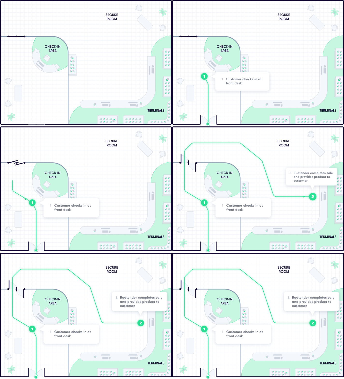
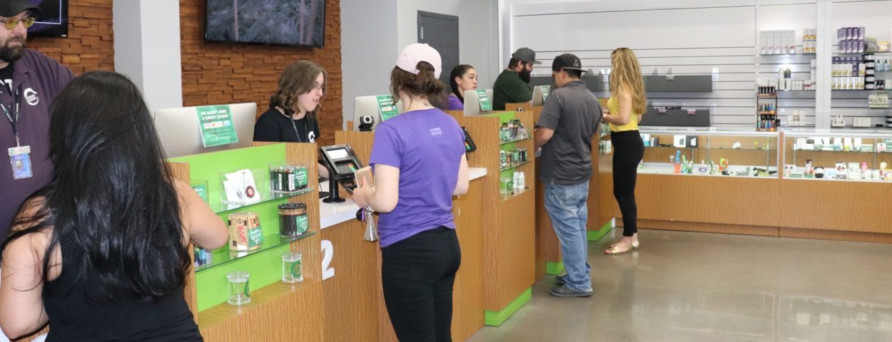
1. The customer or patient checks in and waits in a queue for the next available budtender.
2. The budtender handles the transaction and provides the product to the customer.
Inventory management
This store layout allows multiple options for inventory management: each terminal can have its own inventory, terminals can share inventory, or there can be one common inventory for all.
Compliance considerations
If you choose a shared inventory option, your primary risk is losing visibility into budtender actions and difficulty identifying mistakes and loss. But, a shared inventory makes it quicker at the start of the day. If you choose separate inventory per terminal, you have more visibility, but more challenge with attributing sales to packages because you will have several packages of each product open at one time.

Customer experience
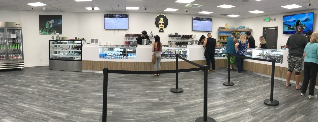
This model is a familiar experience for customers and patients, and one that is generally a positive experience, as long as your staff are friendly and helpful. Do consider your waiting room to ensure safe distance and adequate privacy.
Staffing requirements
This model assumes a one-to-one relationship of budtender and customer/patient, in addition to a receptionist or check in person. Plan enough staff to handle average traffic to ensure short wait times.
Hardware considerations
This model lends itself to hardwired terminals, laptops, or tablets.
2. Pharmacy model
The Pharmacy model is a less common layout type, but is the preferred layout for ultra tight inventory control.
Primary benefit
Single secure inventory
Customer flow
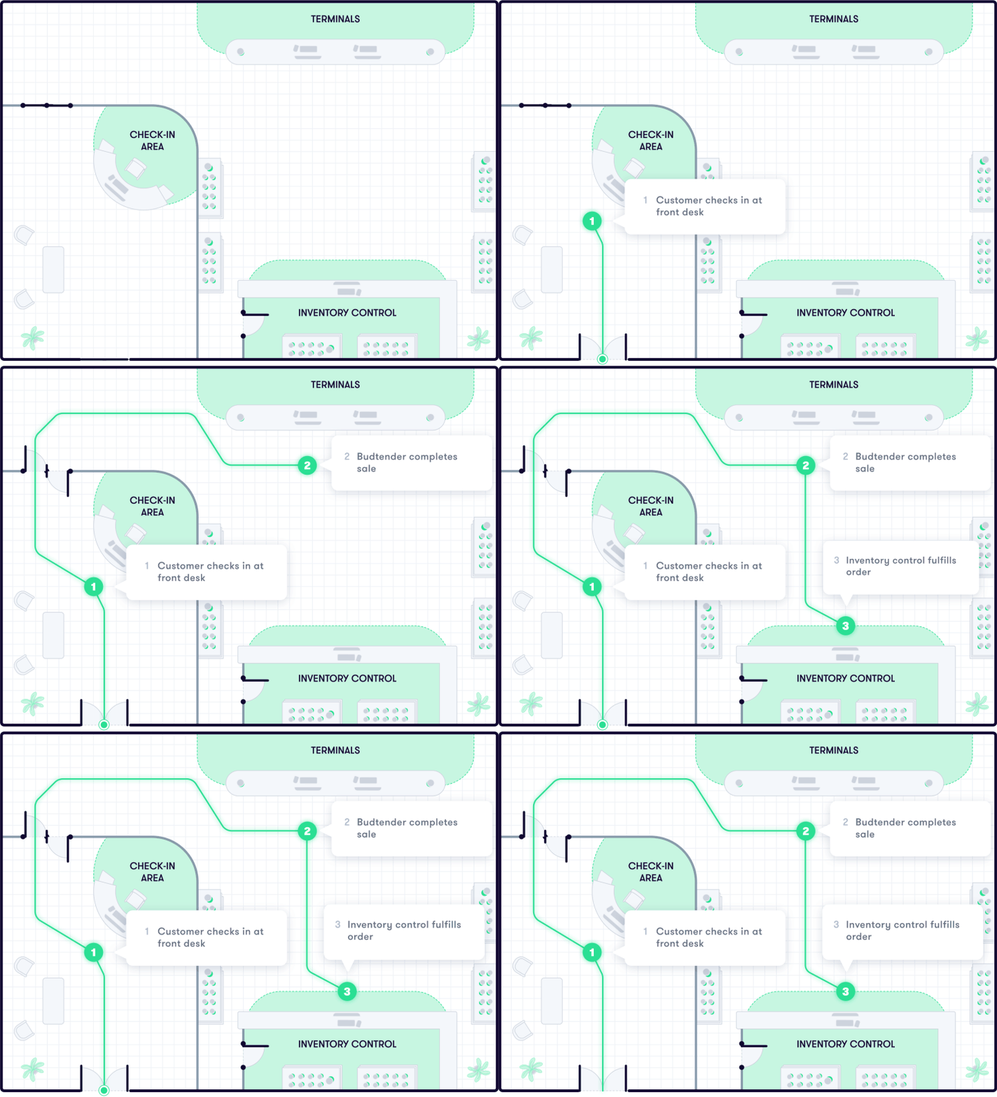
1. The customer or patient checks in and waits in a queue for the next available budtender.
2. The budtender handles the transaction and provides a receipt. The budtender does not provide product.
3. Inventory control receives the order via POS software. Once it's ready for pickup, the inventory employee verifies the customer/patient identity and gives them their product from a controlled inventory window.
Inventory management
This layout is the best for inventory management and security, because it limits who has access to product. It also simplifies the auditing process and reduces loss.
Compliance considerations
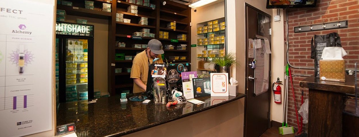
For inventory control, auditing, and compliance concerns, the pharmacy model is the best because all products are in a secure inventory room, accessible to only select employees. That means you only have to audit and manage inventory in one location, and the fewer employees who have access to live product, the lower the security risk.
Customer experience
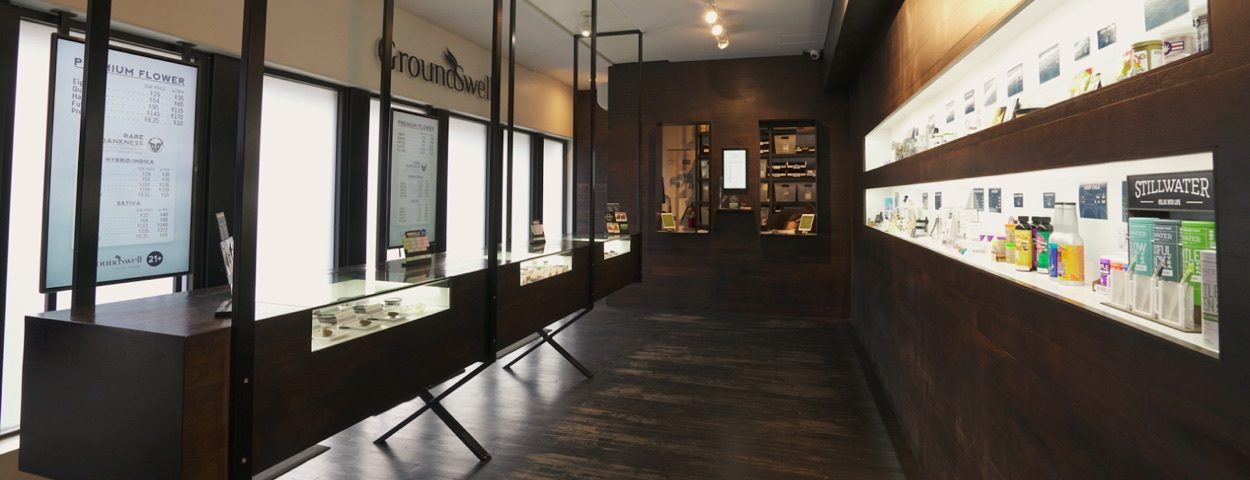
This model is the least positive experience for customers or patients because it feels clinical, and they have to show ID up to three times (at check in, purchase, and pickup). They also have to go to three different locations (and interact with three different people) within your store to make a purchase. This model also leads to longer transaction times and more human interaction.
Staffing requirements
This model requires a budtender working one-to-one with the patient/customer, but it also requires a dedicated staff person working in the inventory room.
Hardware considerations
This model lends itself to hardwired terminals, laptops, or tablets.
3. Mobile model
The Mobile model emphasizes the customer experience but is the most difficult of the models to manage.
Primary benefit
Customer focused
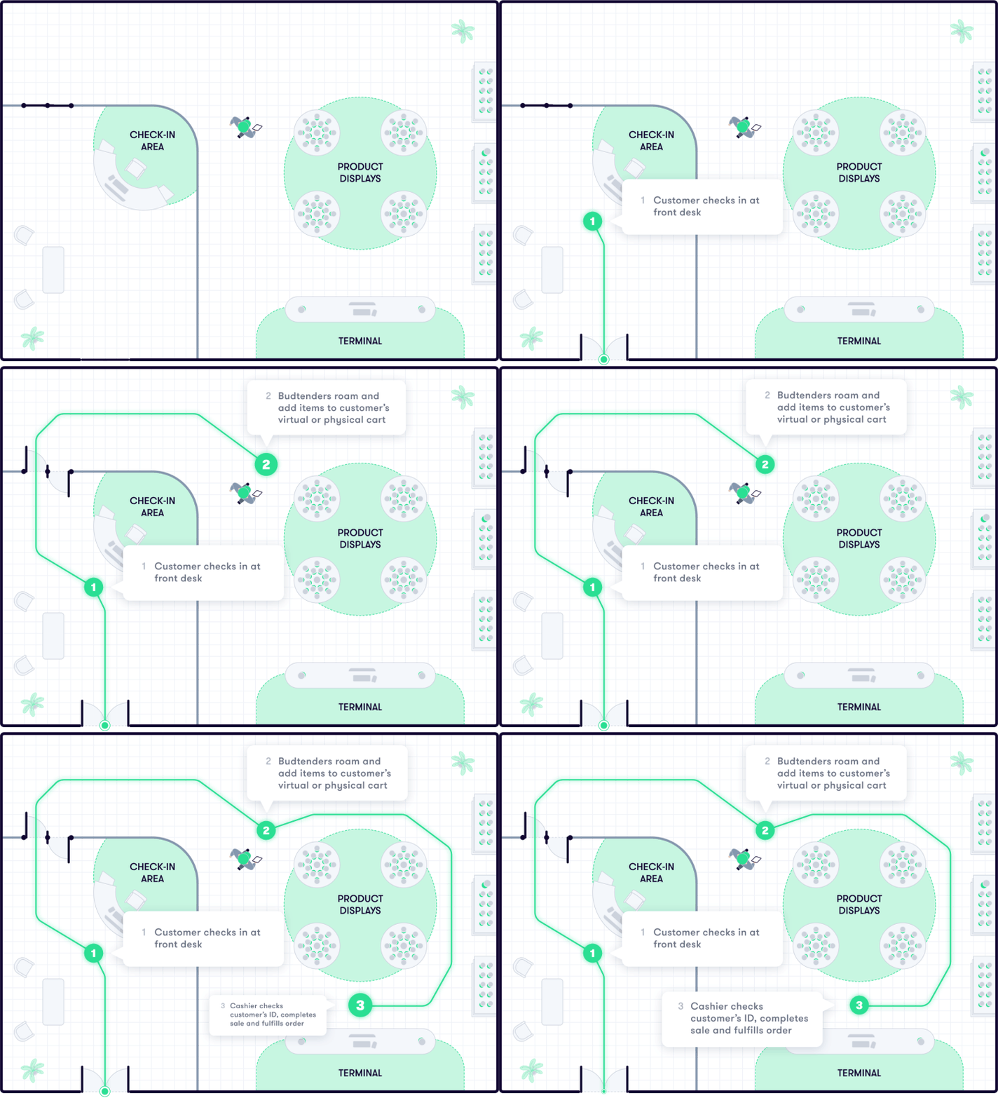
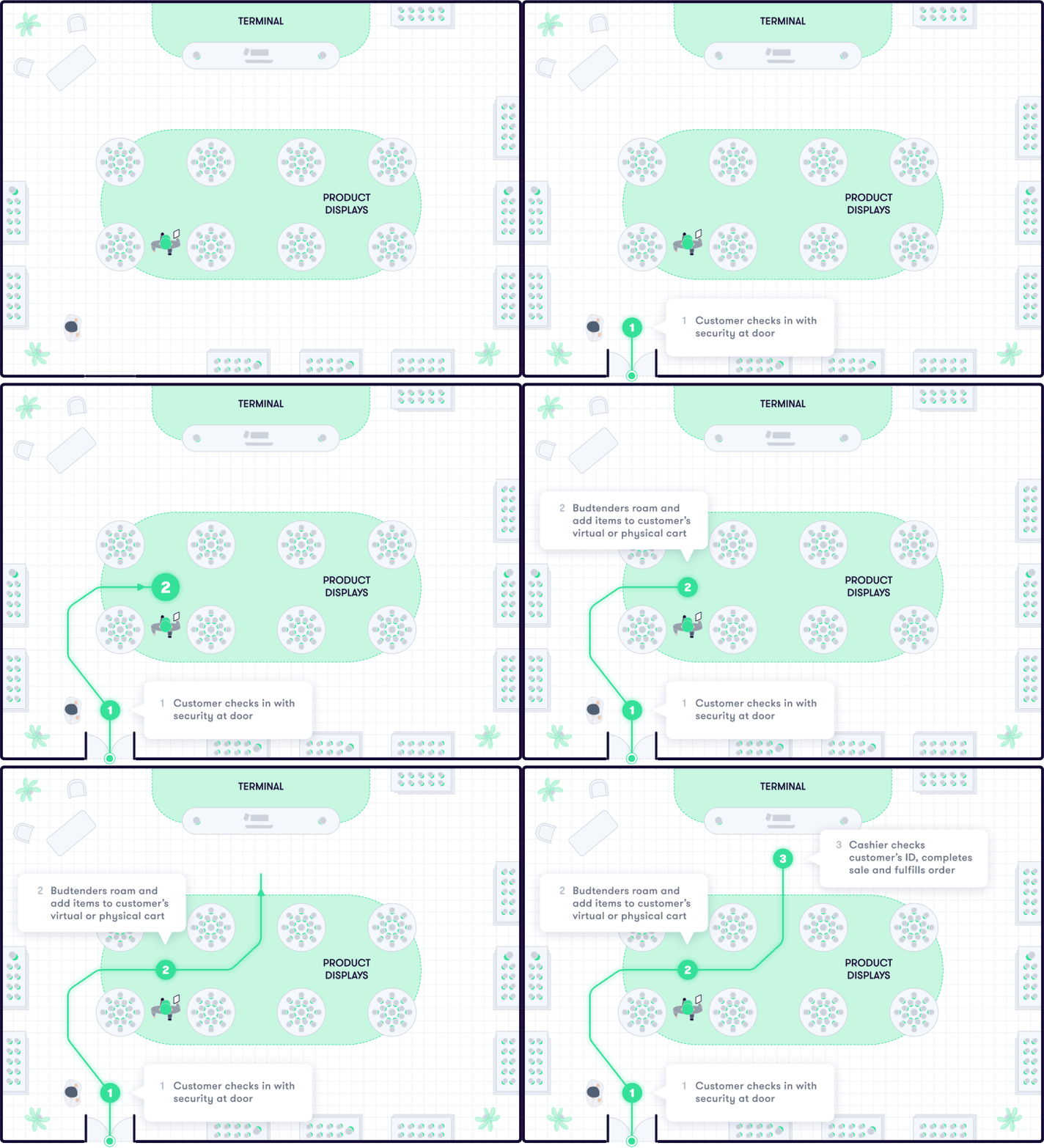
Customer flow
1. For med, the patient checks in and waits in the waiting room. The patient enters the store when directed. For rec, if no waiting room, customers show ID at the door and enter the store.
2. Budtenders roam, either filling a cart with live product or building a cart on a tablet.
3. A cashier completes the transaction. The product is either supplied there like the Bank Model or from a central inventory like the Pharmacy Model.
Inventory management
This layout is challenging for inventory and security, especially if you have live product in displays. You have the same considerations of a shared inventory, losing visibility into budtender actions.
Compliance considerations
To manage this layout effectively, you need to have solid dispensary SOPs and controls for security and inventory. There is an increased risk in having roaming staff and customers with live products all around in display cases. If the product lives on the floor, that means staff will be constantly unlocking, opening, closing, and re-locking cases. You must plan for user error.


Customer experience
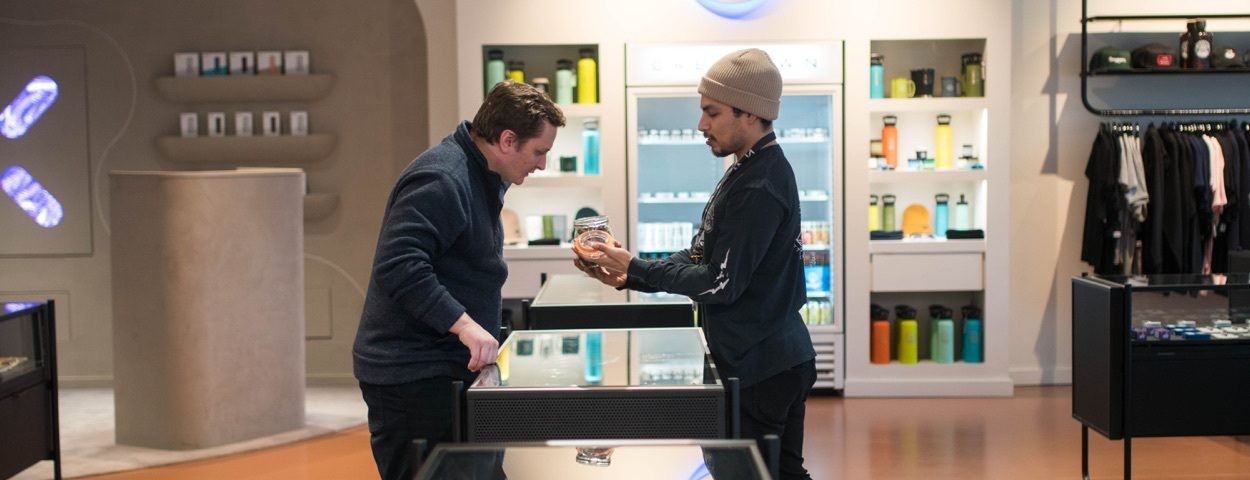
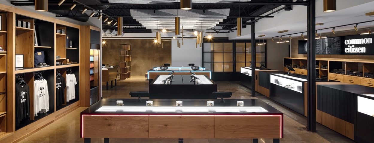
This model is the best for customer experience. It’s a more casual environment, more similar to traditional retail stores, where customers have the space to browse and chat with budtenders. This model has slower transaction times, but higher average orders, and better accommodate order ahead and curbside customers.
Staffing requirements
This model requires more staff, including floating budtenders, cashiers, and fulfillment. You also need a check in person, even without a waiting room.
Hardware considerations
This model lends itself to tablets or iPads.
4. Kiosk model
The Kiosk model is a new dispensary design that’s starting to gain traction in large markets. Think of an airport; self-service with staff on hand to help.
Primary benefit
Customer focused
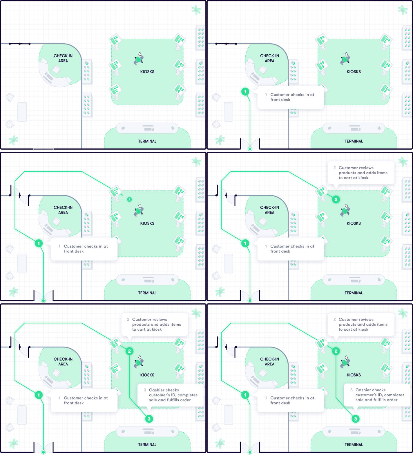
Customer flow
1. The customer or patient checks in.
2. The customer creates their own order at a kiosk.
3. Once the order is placed, the customer works with a budtender to complete the transaction and receive their product.
Inventory management
You can manage inventory just like the Bank Model or fulfill like the Pharmacy Model, which is best for inventory control.
Compliance considerations
This model, especially if you are solely using kiosks for ordering and don’t have live product out to view, is extremely secure. How you choose to fulfill the order will impact your inventory and auditing procedures. If you offer a hybrid model, like a Bank Model with kiosks as simply another option, you'll have the same considerations as that model.
Customer experience
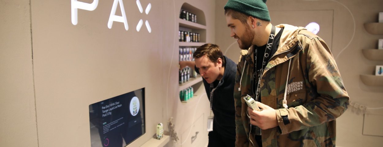
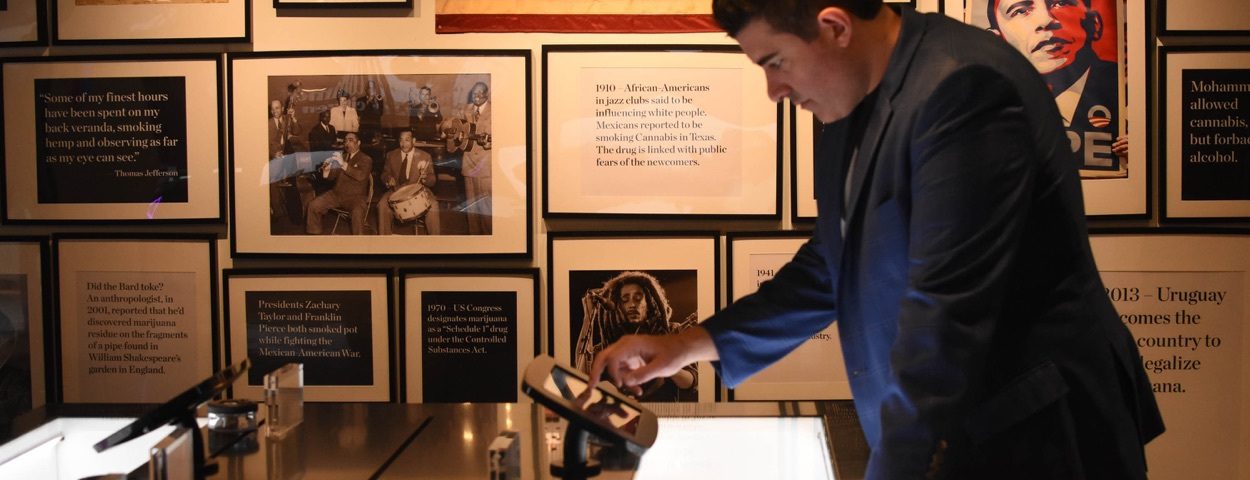
This model provides a great experience for: a) regular customers who know what they want, b) new demographics who want to learn on their own, or c) customers who don’t want to talk to a budtender, or d) customers who prefer to limit human interaction. Kiosks allow education and comparisons, and can also help upsell. Make sure you have staff available to help, and consider offering a traditional transaction option for customers who don’t want to use kiosks.
Staffing requirements
This model requires the least amount of staff, as customers/patients are opting for self-service. You will still need budtenders to assist, staff to check in customers/patients, and staff to fulfill the order.
Hardware considerations
This model requires self-service kiosks or touch displays. You also want fixed or mobile terminals for other customers.


Additional dispensary design best practices

Waiting room
The waiting room is key to success. Make sure it’s well laid out, and give patients/customers something to do, something to learn, or something to buy. Comfortable seating is a must, and consider how customers can spread out when waiting. If you’re cash only, an ATM is recommended. Also consider selling non-cannabis products in the waiting room, like supplies, CBD, or merch.

Kiosks/TV displays
Even if you don’t choose the kiosk model, consider the use of kiosks, TVs, or interactive educational tech. These tools can help new patients decide what they want or explore new products, decreasing transaction times and encouraging upsell before customers/patients even talk to a budtender. Other ideas include monitors to display live menus, advertisements (for partners, specials, events), or video content.

Special touches
Every detail makes an impression on customers. From the doorknobs, to floor treatments, to color, and art, consider how everything fits together. Make sure every detail aligns with your vision and creates the experience you want to offer. These special touches can be a motivator for return customers. For example, if you have a rotating art gallery, customers may want to visit frequently to see the current exhibit.

Branding
Showcasing your brand isn't limited to your name and logo on your building. You have opportunities throughout the store to build name recognition. At a minimum, put your logo within your store, maybe behind the sales counter. Then, consider other ways to add your brand into your store design, like on rugs, merchandise, bags/packaging, and even product signage. Make sure every employee is wearing something that clearly says your brand name or includes a logo.
Exterior
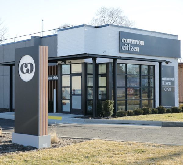
Even if you rent space, you have some control over the look and feel of your space. First impressions matter; make sure customers get the right vibe before they pull into the parking lot. Keep your space clean and tidy. Consider plants in beautiful planters, outdoor seating, and stylish bike parking. Make sure any fences or outdoor structures match your aesthetic and are well-kept. Finally, make sure you have clear branding, including an "open" sign.

Display cases
The cases you choose to hold your products can make or break the store experience. For a mobile model, customers need to be able to see all product. Make sure all cases, shelving, and decor match. Finally, think about refrigeration. An outdated, noisy fridge holding your sodas or candies can kill a look. Invest in quality displays that fit your desired aesthetic. And don’t forget about signage; customers need to know what they're looking at.
Program space
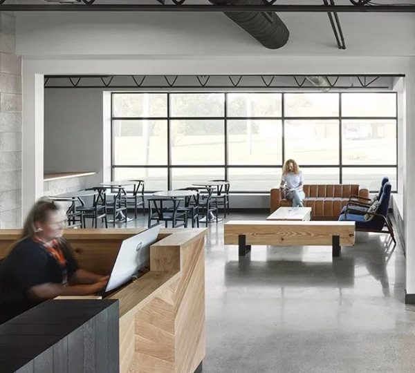
If space allows, you may want to consider having wellness or community space and programming. For example, you could have wellness practitioners (massage, acupuncture, etc.) use a private room in your dispensary. You could offer programs to customers/patients periodically to drive business, or rent the space to groups and practitioners as an additional revenue stream. Alternatively, a spacious waiting room could double as program space.
Multiple business types
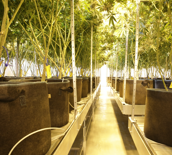
Some cannabis dispensaries are giving a nod to distilleries by giving customers a glimpse into the other side of the business. For example, if your grow is in the same building, open up a wall to let guests see the plants. Perhaps even put up placards to educate on the cultivation process. This is a value-add to customers and may even encourage them to bring friends and family. Additionally, consider opening a coffee shop or restaurant within your dispensary.
Future plans
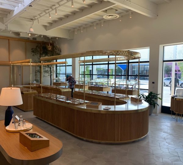
The industry will continue to change rapidly, especially with new tech. Consider how your space could adapt in the future. If you’re currently medical only, but want to get to a mobile model, plan what that looks like, what needs to change, and how you can work toward that goal. Build your space with the future state in mind, maybe with a divider between the waiting room and store that could one day be removed. If you know where you want to go, it's easier to plan for it now.
Conclusion
As the cannabis industry continues to expand and innovate, we expect to see dispensaries pave the way for enhancement. Both customer experience and inventory management are key factors in how a dispensary looks and feels, but it’ll be interesting to see how brands continue to raise the bar, especially in light of cultural adaptations, pandemics, and changing buyer preferences.
While the above lays out 4 common dispensary layout designs, the rules are fluid. Many modern dispensaries are innovating by using hybrids, maybe having a kiosk model incorporated into their existing bank model. Or offering kiosks for educational purposes, but still using the bank, pharmacy, or mobile model for the actual order and purchase. And the shift toward ecommerce is opening the door for mobile use-cases for curbside check in and payments.
Regardless of which model you choose, and how much innovation or tech you add to your dispensary design, the future of cannabis dispensaries is for you to create.
